Community service made easy

Existing volunteer platforms are outdated and do not match volunteer preferences and behaviour
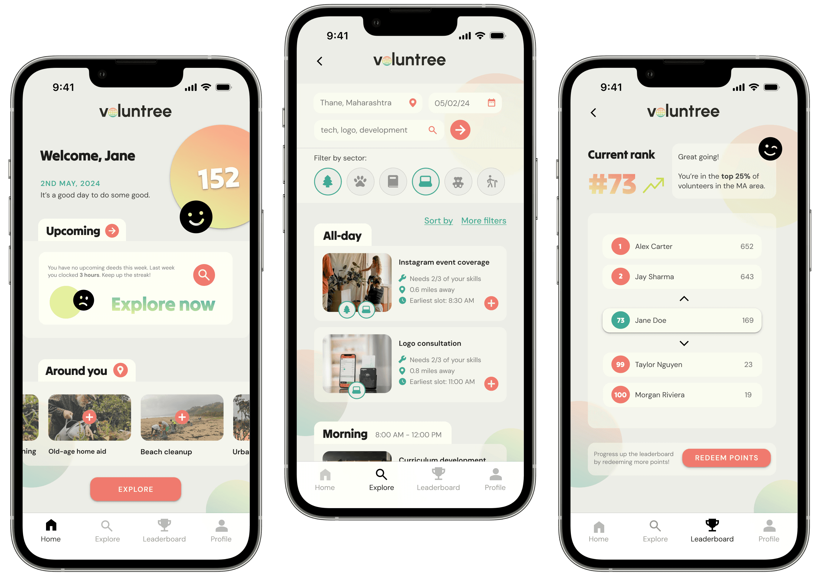
A skill-based volunteer matching platform, aligned to volunteer behaviour
-> UI/UX researcher and designer
-> Branding and logo designer
-> Self-led project
-> 9 weeks
Research
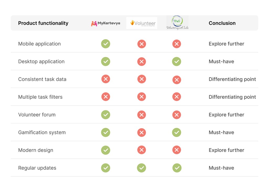
Since a few India-centric volunteer matching platforms already exist, I began with a competitive analysis.
For each of the 3 market leaders, I explored the user interface and noted strengths and shortcomings.
Based on this, I produced a feature comparison list that concluded in 3 types of notes: differentiating point, must-have or explore further.
Non-profit org.
“Our biggest problems are no-shows and inconsistent volunteers; it’s really important for us to take stock of available labour before we arrive at the site.”
Volunteer
“I’d love for there to be some integration with calendar apps or reminder systems because often I sign-up weeks in advance, and then completely forget.”
🔗
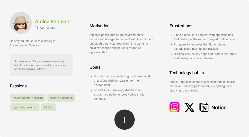
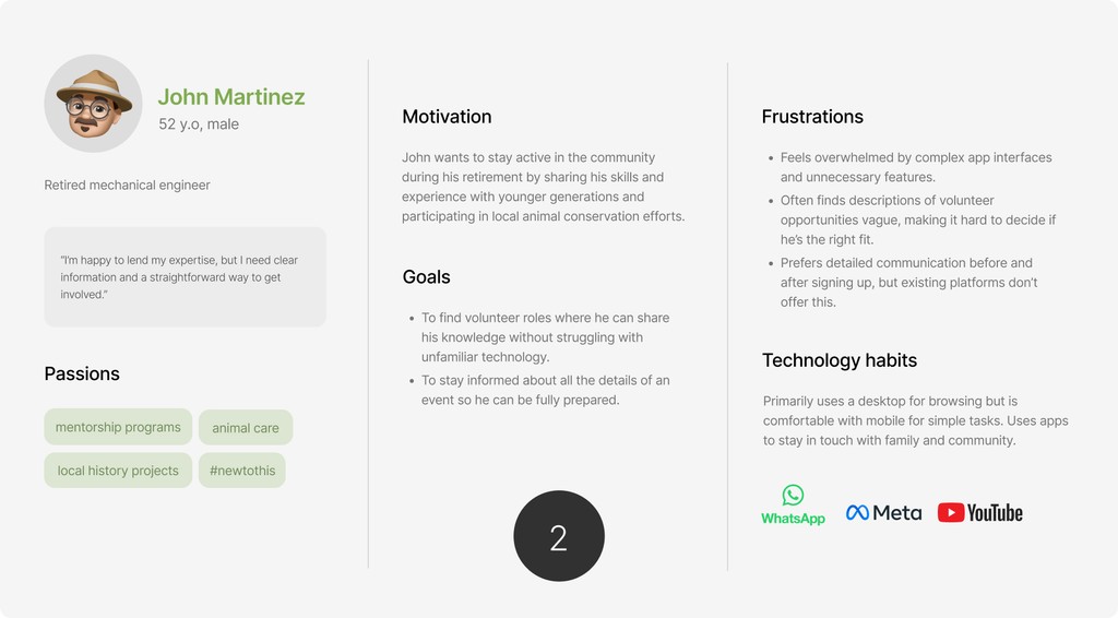
I interviewed 3 volunteering enthusiasts and 1 non-profit organisation representative, hoping to find an alignment between the two stakeholders.


3/3 volunteers found existing platforms outdated and unreliable
3/3 volunteers reported difficulty with filtering tasks according to their skillset
2/3 volunteers prefer mobile applications or support
Organisations are unsure what/how much information to list about the task
Engaging with users helped validate or contest findings from my market research. While the competitive analysis featured more desktop support than mobile, respondents clearly indicated that mobile was the way to go.
Ideation
From user interviews and personas, I gained a solid understanding of the target users' problems and how to solve them. Before jumping into the design phase, I wanted to formalise a list of features and design criteria in the form of a product requirements document (PRD) This allowed me to simulate a realistic product design process.
+
->
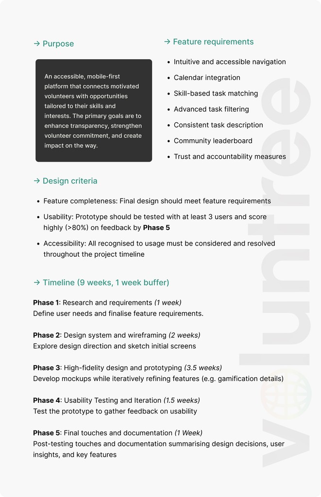
Access the product requirements document here
From the PRD, I was able to extract central task flows within the app. Given the diverse user base, I wanted to ensure each process was logical and intuitive to follow. A flow diagram was the ideal method to visualise and evaluate this.
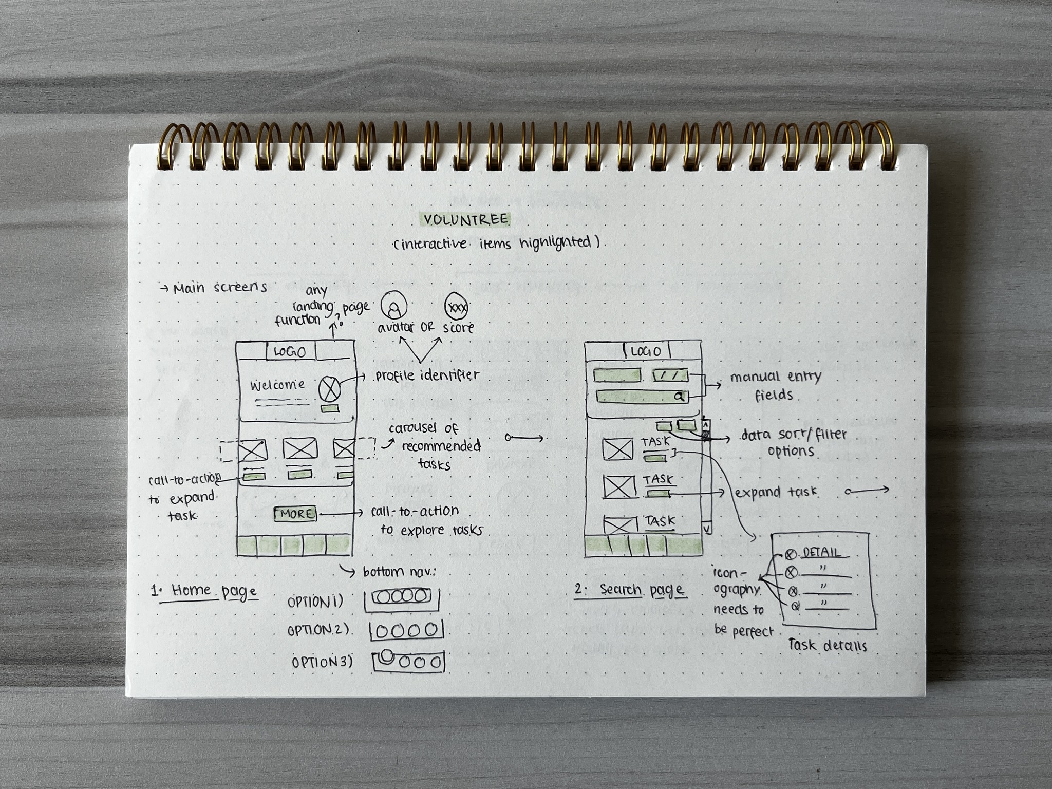
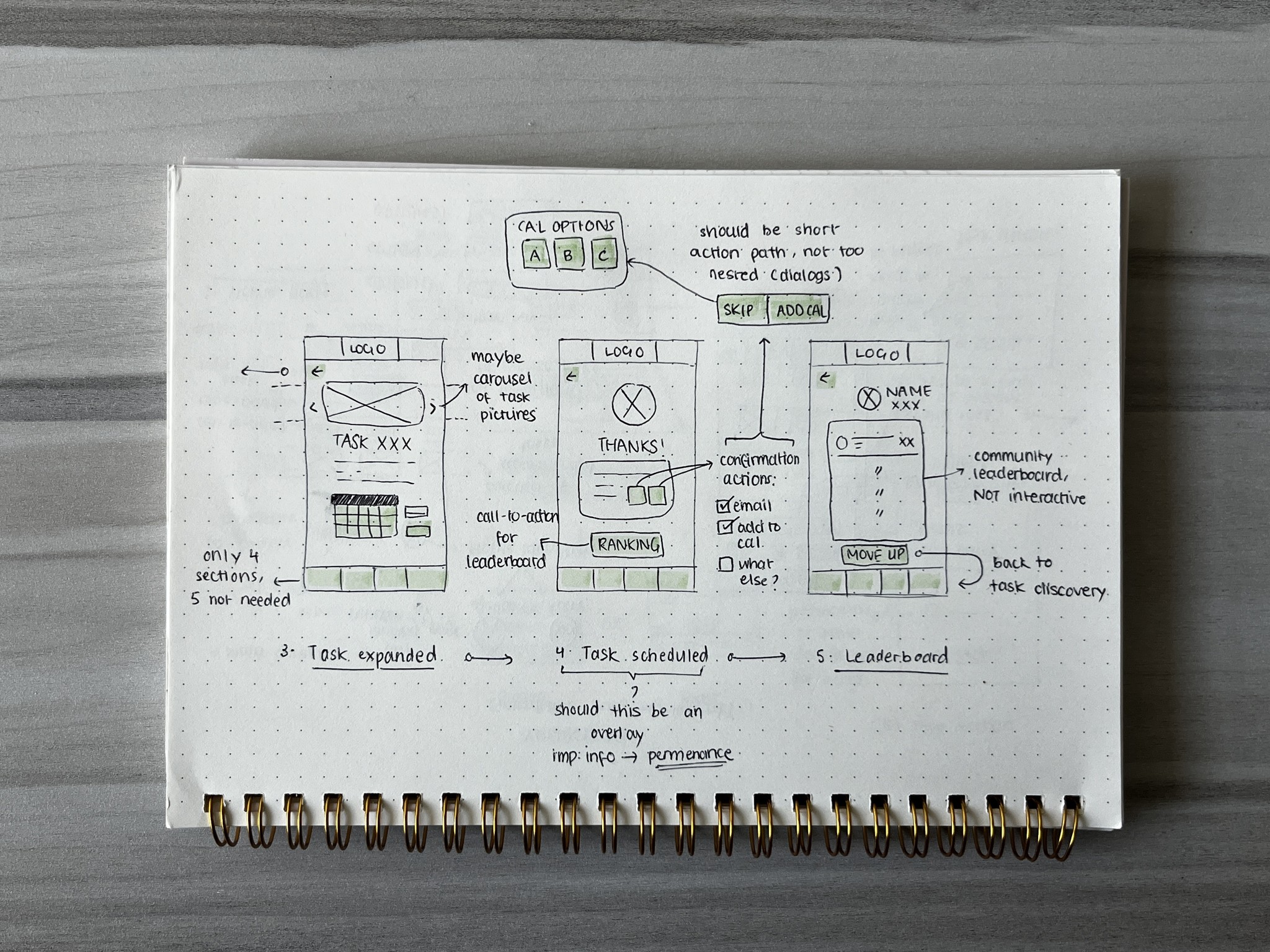
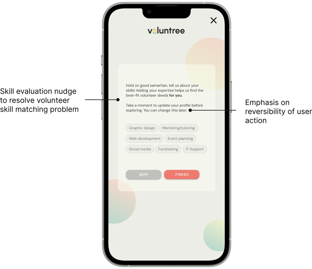
I sketched the baseline user interaction with main screens, finalising on some ideas as I progressed. Another focus point during this phase was to identify the kinds of data that would be required of a user.
Voluntree
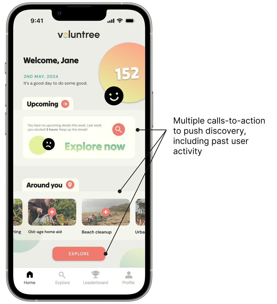
Selected location
Upcoming
Around you
Modify
Modify
Welcome!
Explore
Last, a nudge to move to another discovery section of the app
User-specific data (e.g. name, location, points) is prioritised
Followed by a summary of past user actions to transition into the app’s functionality
User-specific
discovery section
Voluntree
xx/xx/xx
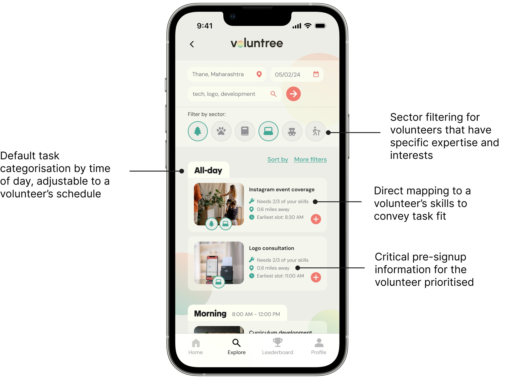
Selected location
Select industries
Search
Show more
Condensed version of data to provide adequate information
User controls whether more data is retrieved or if the query has been satisfied
Standard layout of filters and data entry fields prior to data retrieval
Search functionality positioned last for highest level of specificity
Scrollable container of
retrieved data; enough but not too much
Voluntree
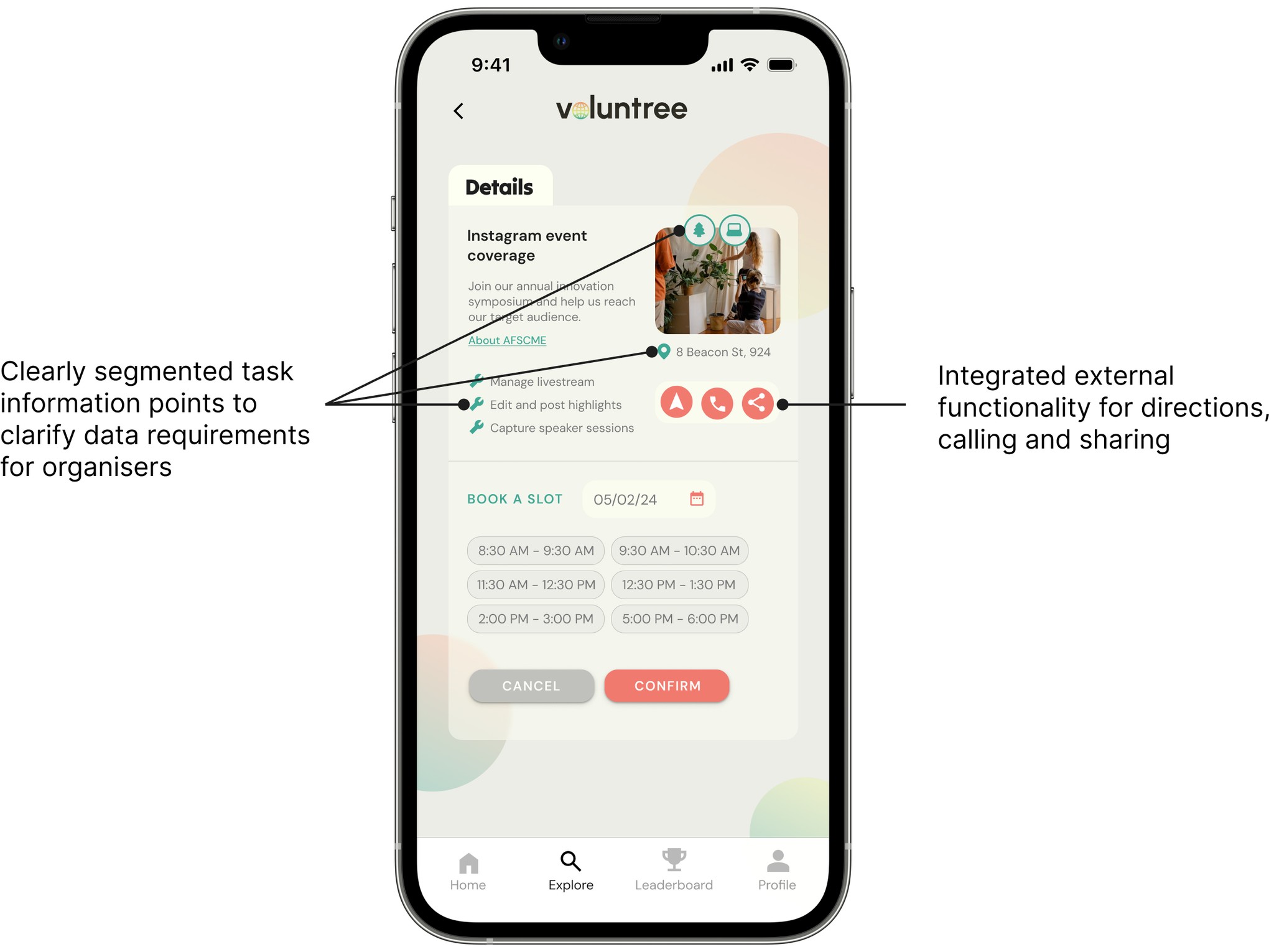
Details
Available slots
Opportunity #1
Cancel
Confirm
xx/xx/xx
xx:xx pm
xx:xx pm
xx:xx pm
xx:xx pm
xx:xx pm
xx:xx pm
Dynamic querying of data based on user input
Classification of low-level details into categories relevant to the user
Brief information points for a high-level view
Voluntree
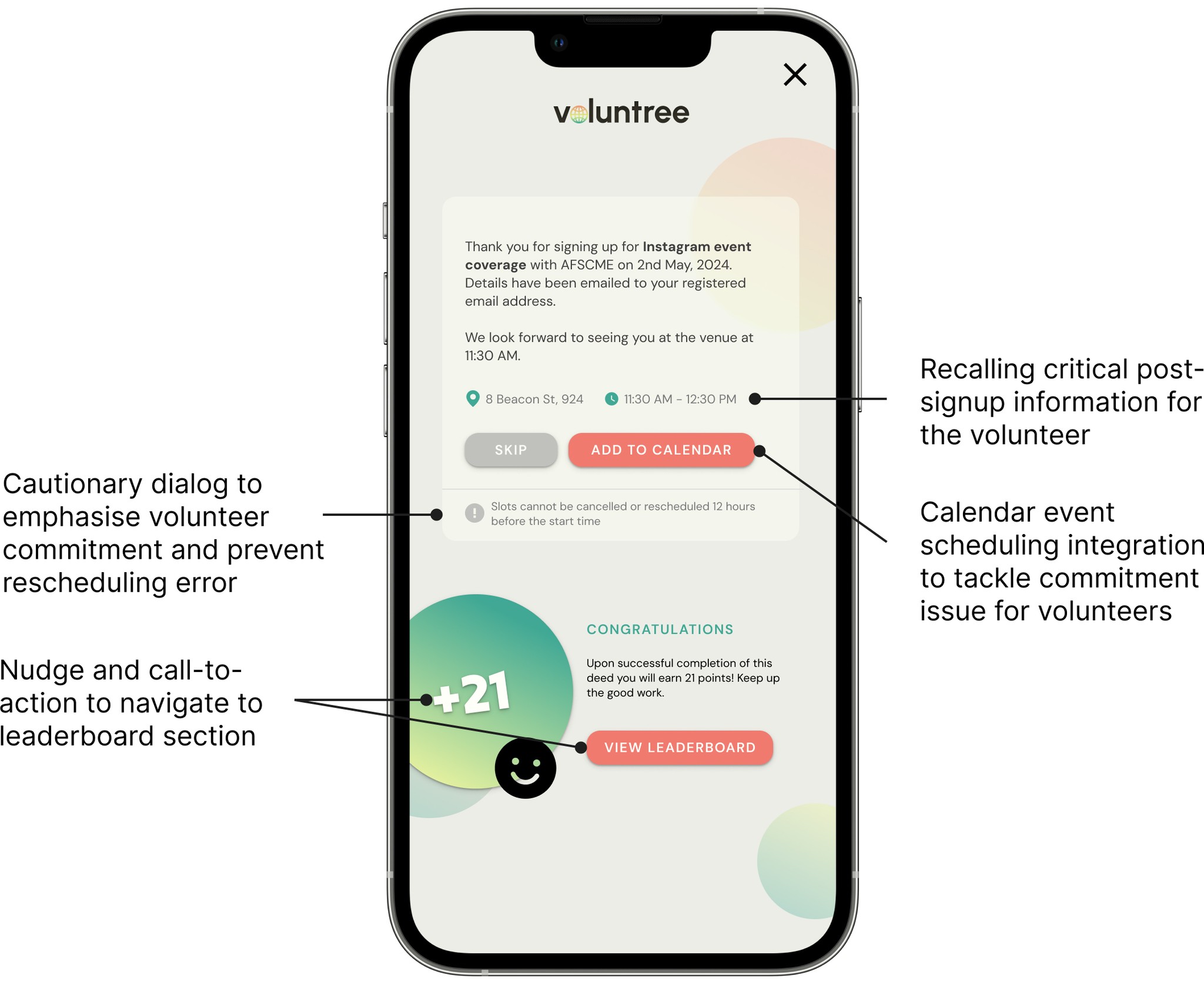
Your slot is confirmed!
Congratulations!
Modify
Add to calendar
View leaderboard
Open in Maps
Logical nudge towards the leaderboard section of the app
Followed by further optional actions, dependent on the user’s preference
Feedback and action status prioritised
Voluntree
Rank XXth
XXXX
XXXX
XXXX
XXXX
XXXX
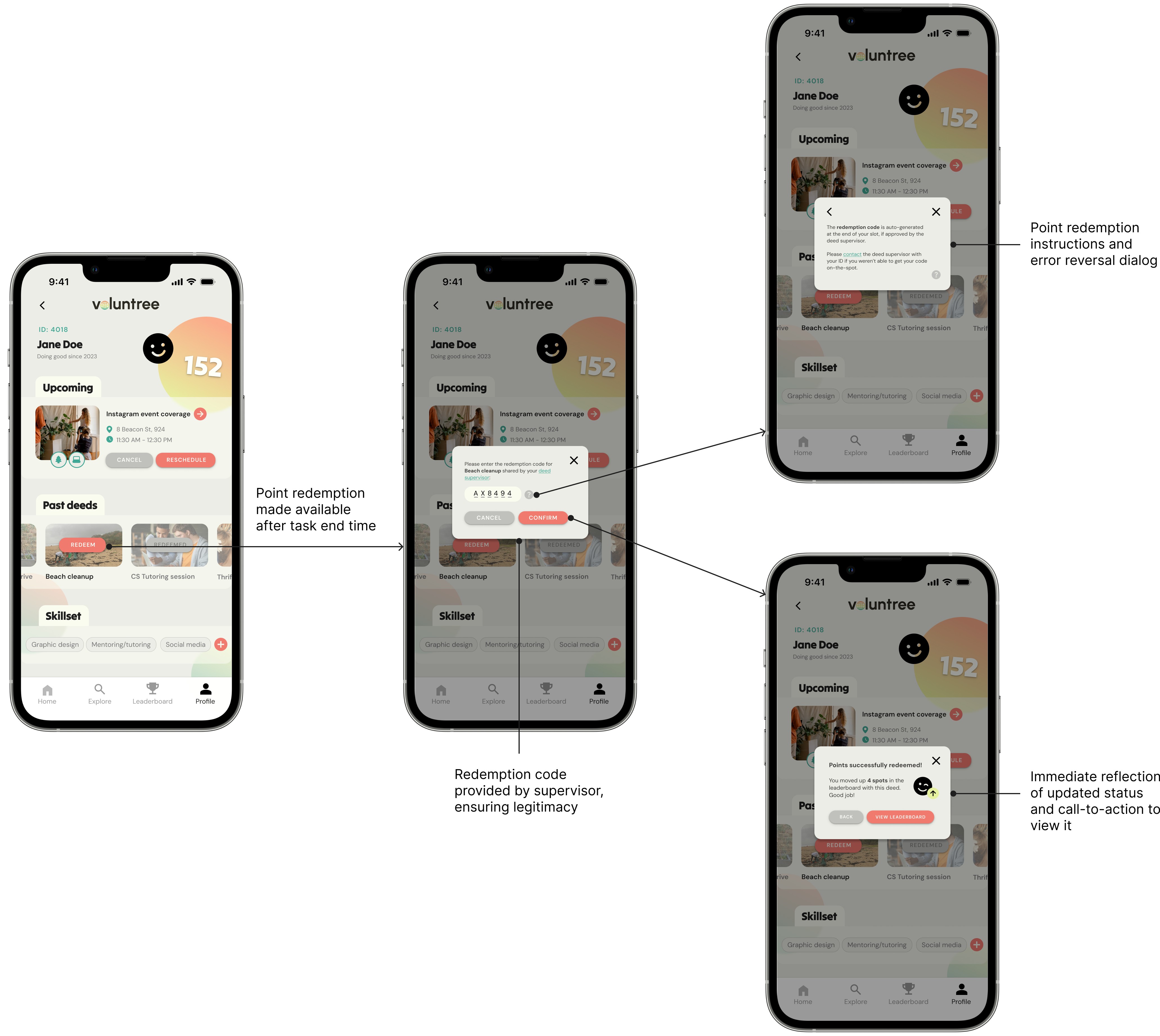
Redeem points
Scrollable container of
retrieved data
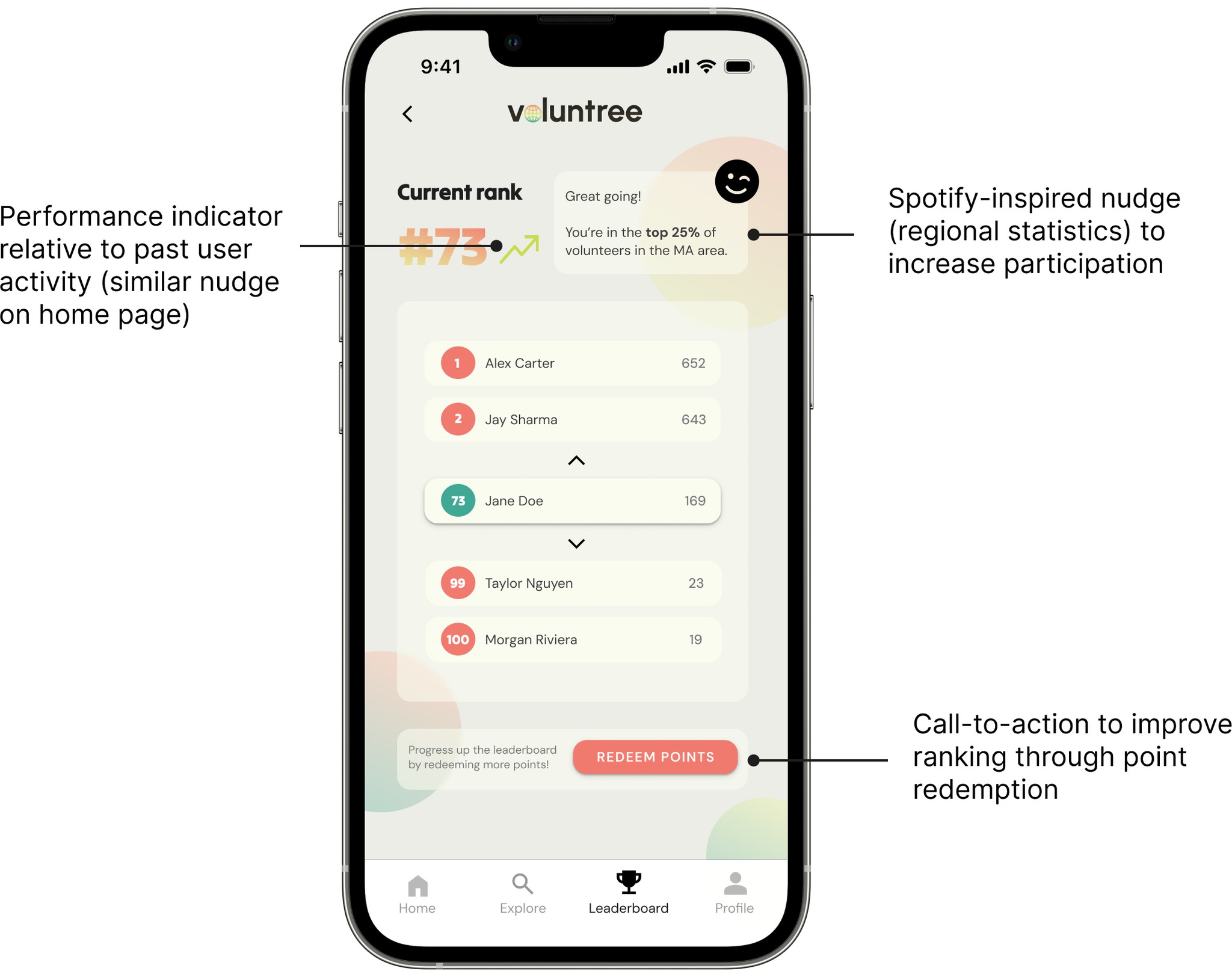
User-specific information is prioritised and highlighted
Secondary relational data is displayed just below primary user information
Logical nudge towards
the user page and points redemption system

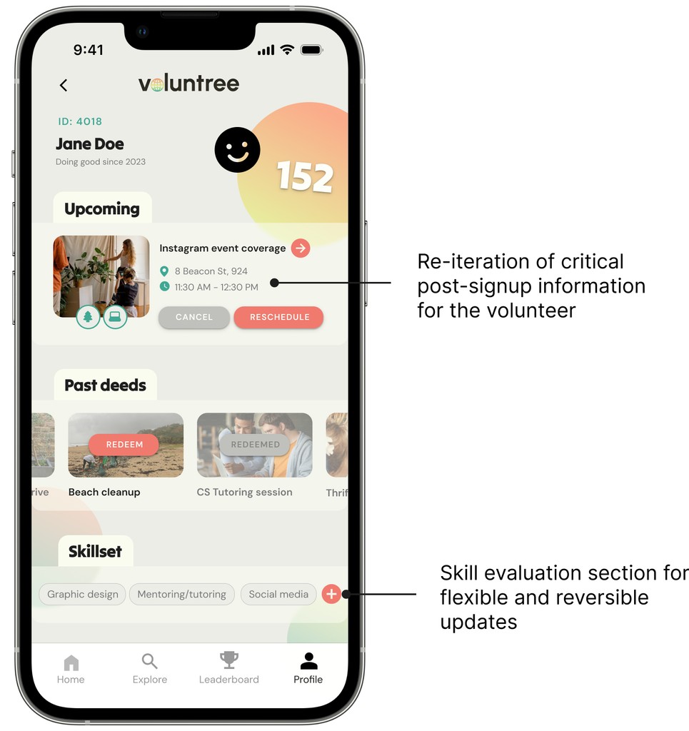
Critical action options for upcoming user activity
Secondary action for past user activity
Last, tertiary action is within reach to update the user’s preferences
User information status is prioritised

Building accountability
User research highlighted a severe issue with volunteer commitment, last-minute cancellations, and even no-shows.
To acknowledge this, I devised a dynamic system that only offers cancel/reschedule options up to 12 hours before (i) the task's start time. Within 12 hours of the task start time (ii), these options are replaced with a contact button. Recognising that emergencies can arise, this prompts volunteers to contact the assigned task supervisor if they unexpectantly cannot attend.
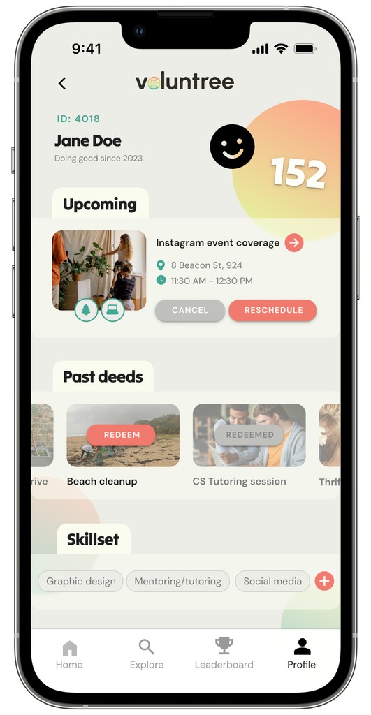
i) User page BEFORE
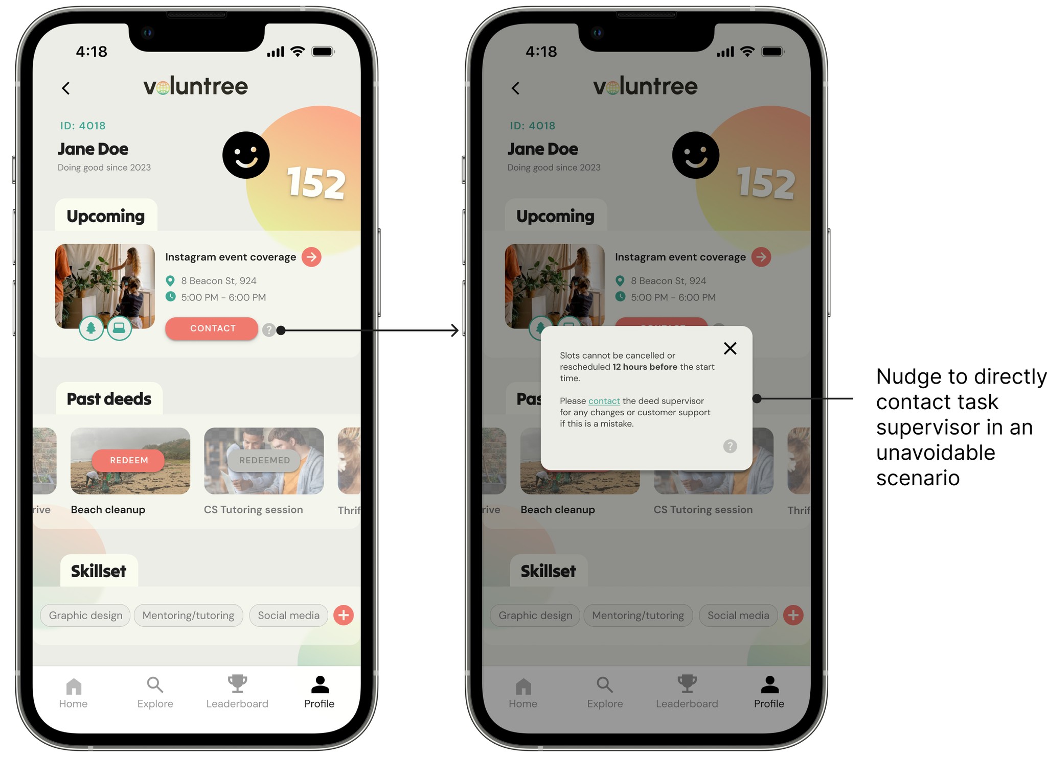
ii) User page AFTER
This decision strengthens alignment between primary and secondary user personas by balancing volunteer flexibility with the organiser's need to prepare for shortages. Direct communication between the two parties fosters accountability on the volunteer's end and clear expectations for the organiser.
Obviously, this cannot entirely fix the accountability problem because it might not be enough motivation to inform the task supervisor of unavailability. The hope is that since points can only be redeemed after successful task completion, an unredeemed task will reflect badly in the long-run as it might signify a no-show.
Community, not competition
A key feature of this design is the community leaderboard. It's meant to encourage friendly competition towards a greater cause.
While thinking about the underlying gamification strategy, I prioritised a careful balance between reward and punishment. Volunteering is an act of goodwill; it should not be solely undertaken to rake up points otherwise it loses all purpose.
Points aren't deducted for cancelled tasks or no-shows because they’re only allocated after completion. This also means no negative consequences for a lack of consistency in signing up - people can participate as actively as they wish. This flexibility is meaningful for those who only have a little time to spare.
Since this was a concept project and not intended for production, I wanted to concentrate on feature satisfaction during the summative testing phase. Based on the results, I could further refine my concept.
Overall, the 29 survey respondents were highly satisfied with their experience on the app. Specifically, they felt positively about the interface design (colours and microinteractions), and the prospect of task matching.
However, there were some concerns about the 12-hour threshold for cancelling/rescheduling task appointments. Many thought the threshold was appropriate while others felt as though it was cutting it too close.
There can never be enough opinions - let me know what you think below.

This was one of my first experiences in UI/UX research and design. Hence, this let me apply theoretical knowledge from coursework to a field I am passionate about. I gained proficiency in adapting research methods for a wide range of user age groups (11 - 28 years old). I also enjoyed delving into the psychological face of design by prioritising motivational factors. Lastly, I strengthened my grasp of industry-level deliverables through a dedicated design system and components.
-> Interaction with organisations: While this work is heavily informed by the perspectives and requirements of students who would use it, it does not equivalently cater to the potential needs of organisations offering volunteering opportunities.
-> Further gamification: The design can benefit from more gamification and in-built motivation measures. The overall volunteering score can have a real-world mapping to encourage more activity.
-> Bandwidth filters: For especially busy or tired users who still want to contribute, the design could include a bandwidth filtering option that categorises jobs by level of effort or energy.
Voluntree

by Nishtha Das
